Showing posts with label Events and Attractions. Show all posts

The Art Gallery of Alberta


I don’t really like the new art gallery.

I haven’t been inside it yet, and I do expect that the interior spaces will probably improve my opinion a bit. Based solely on the exterior though - having now had a few months to come to terms with it, and having recently spent a fair bit of time thinking about how it works in order to get the model right - I’m not really a fan.

The new gallery is certainly a good thing for Edmonton. The design competition got people interested in architecture. The AGA now has better space and (a little) more room. And it is a building that people seem to like and find interesting (for now, anyway). So it is undeniably a positive for the city, but that doesn’t mean it is beyond criticism.

Paint it black

My main concern with the building is the glazing. It has a grey reflective tint which I think was a huge mistake.

This is what was shown in the early renderings:


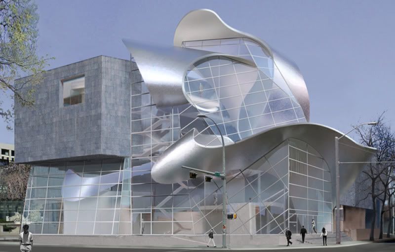
With some tweaking and artistic license this is closer to what we got:


The main feature of the AGA is the Borealis sculpture. It twists through the building, and in the rendering its transitions from interior to exterior and back again are clearly visible. The Borealis can be perceived as a single element that weaves throughout the entire building and that binds it all together. Unfortunately the reality is that the windows are hard barriers, and the Borealis actually appears as a decapitated collection of confused and seemingly unrelated elements. Any connection between exterior and interior is lost.

This lack of connection also has a dramatic effect on the way that the building relates to its surrounding. This is the gallery’s restaurant during weekend brunch:


This is a lifeless building. City Hall across the street uses transparency to great effect, but here the glazing is dead and inert. The building is already very, very grey and the windows should add lightness to it, but instead they only make it worse.

This is exaggerated by the way that the building fills its small site. The old gallery had a sizeable front plaza, but that is now gone with the expansion pushing right up against the property line. This was probably for the best since it increases the gallery's prominence from Churchill Square, but it means that there is no longer any transition space. The entrance is a labyrinth of practical ramps and railings, and there is no space left to just breath. You are either inside or you are outside; separated by the cold, dark glass.

During the design competition there was praise over the fact that Stout Architects recognized Edmonton as a winter city, and provided a snowy rendering to match. In recognizing us as a winter city though, they appear to have failed to realize that we are equally not a winter city. The gallery will undeniably look its best when it is lit up during the darkest depths of winter. At the height of summer, though – when Churchill Square is filled with crowds and the sun is shining late into the evening – it will be an inanimate grey lump squatting on the corner.

The unfortunate tint does serve a purpose - it is presumably there to reduce the cooling load on all the east, south and west facing glazing. That is an admirable enough goal, except that this is a building that is wrapped in a giant metal bow. Taken in that light any arguments of prudence ring a bit hollow. The tint significantly weakens the overall design, and it destroys the building’s interaction with its surroundings. It was not worth it.

Getting it (w)right

The debate over elaborate galleries that overshadow their collections has been around since at least Wright's Guggenheim, and likely for much longer than that. The millennial fad of starchitecture has taken that a step further, and now the world is dotted with galleries and museums that are as much sculpture as they are structure.

At first glance the AGA seems to be yet another example of this, but there is one important difference. Rather than being a sculptural building, the AGA is much more of a building and a sculpture. Generally with Gehry, Calatrava, Libeskind, Hadid and the others the line between building and sculpture is difficult to determine - just where does the space end and the flourish begin? With the AGA that point is easy to identify:

Building + Sculpture


Building


This brings up an idea - view a gallery exterior as a blank wall that is simply another display space for art. Build a structure that is functional enough, and then install a large-scale sculpture on, in, or through it. Then every decade or two commission a new work, and move the old one to a nearby park. It could keep a building fresh in the mind of a fickle public, while also strengthening a city's public art program (although the logistics of it would certainly be a nightmare).

Depending on your perspective that could sound like either an excellent idea, or a terrible one. The AGA is already a fair distance down that road, though. It is a building that effectively has a large sculpture as part of its permanent collection, but it has also been designed specifically for that sculpture. What I have to wonder is if the Art Gallery of Alberta were to commission a great sculpture for their collection, would Randall Stout be the artist that they would choose?

This item has been discontinued by the manufacturer

Treating a building as structure + art leads to some interesting questions. Here is an earlier rendering of the gallery from the design competition:


If I had to quickly describe the AGA I would mention the zinc, the cantilever, and the swoopy bits. I think that those three elements are the key to its aesthetic; the swoopy bits being the most dominant and defining part of the "look" of the building. From concept to reality then, all three of those elements are still in place. It also seems that the bulk of the square footage - the back section, the restaurant and the cantilever - remains basically unchanged. The swoopy bits however, and the whole front section around them, are completely different. They have the same basic style, and if they were actually sculptures they would clearly be part of the same series, but they are also distinct works that look quite different from one another.

If a building is structure + art, and if you swap out the art with a different piece, do you still have the same building? Is one Stout sculpture just as good as the next? Did they just run out of the first one, or did it get used somewhere else? What if you really liked the curved knife-edge that was over the restaurant in the early design, or the way that the ribbon was kinked at the rear? Is art really fungible?

I'm not saying that buildings can't change from concept to construction. If a design from one of the other architects had been selected it would certainly have seen some evolution. In a combination of structure + art though, what drives a wholesale change in the art? The Borealis sculpture does have a bit of a functional role, as it supports a fourth floor meeting room and wraps around the main stairs. Was it impossible for the original sculpture to meet those constraints? The changes from concept to reality may demonstrate how flexible the overall design is, but they also reveal how arbitrary it is.

Form follows whim

It irks the modernist in me that a building's appearance can change so significantly without a corresponding change in program or function. It probably irks the classicist in me too, since it's not like the ancient Greeks just threw things together either. If you are feeling charitable though, you could argue that by distilling today's trends down to structure + art the AGA is simply being honest.

We are in a time when clients clearly expect grand, sculptural gestures. Rather than using showy contortionism to twist a building into a pretzel, why not just build a grand sculpture? Prior to the rise of modernism architecture and sculptural embellishment did go hand-in-hand, so it's possible that this is just a return to an older tradition? I don't happen to view the building that way, but you could if you wanted to. I tend to see it more as a cynical attempt to give people what they want; I will accept that the truth is likely somewhere in between.

What's new is old

When the winning design for the AGA was announced back in 2005 it felt old. Gehry's Guggenheim and Concert Hall are two of the most photographed and filmed buildings in the world, and wouldn't it have been for the best to just shy away from anything superficially Gehryesque? How could anything measure up, let alone actually feel new or exciting?

In the intervening years I've softened a bit on this. The building is still desperately trendy, and it is still a decade too late. It is also a building though, and what is one decade in the life of a building? In a few years no one will remember whether it was built in 2000 or in 2010. It will be clearly recognizable as one of those galleries and museums that everyone was building at the dawn of the shiny new millennium, and whether it was a leader or a follower will fade.

It certainly won't put Edmonton on the map though, since mid-sized cities around the world have all tried to capture some of that old Bilbao magic with similar projects. And as Edmonton's great leap forward it is unfortunate that we had to clutch so tightly to the coattails of others. It is the only building of its kind for nearly a thousand kilometers though, and even in our electronic world that still has importance.

Grist for the mill

What is one decade in the life of a building? In Edmonton a lifespan can be troublingly brief - the old art gallery was a few years shy of forty when it was torn down.


Some people loved the old gallery and others hated it. It certainly wasn't exciting or cuddly, and this city has no shortage of other brutalist concrete, so a general disregard and apathy are not surprising. For my part I liked it, but I didn't love it. I really liked the second floor space, but disliked the first. As with anything it had the good and the bad.

Of the four proposals for the new gallery two of them (and possibly a third - it's hard to remember) worked to incorporate the old gallery. The winning design didn't. It is certainly true that a large section of the original building still remains at the rear, but rather than being preserved or highlighted it has been rendered unrecognizable. It was simply consumed as a raw material and nothing more.

There were other options available, but this is the one we chose. Sadly, that is typical of Edmonton. History is an embarrassment that should be wall-papered over. If we could just start from the beginning again, this time we could make everything perfect. We've been trying that for at least fifty years now, and I don't think it's worked yet.

All the angles

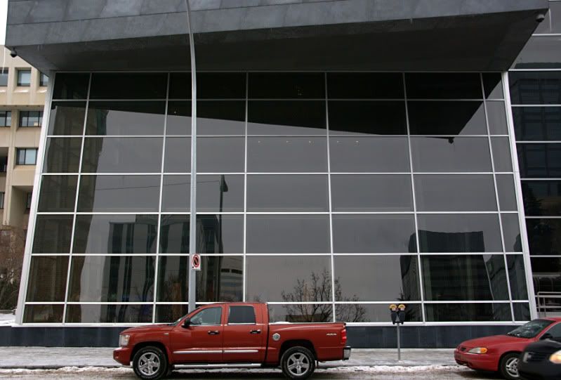
With all of that - the lifelessness, the intellectual three card monte, the calculated fadishness, and the casual dismissal of the past - if I actually liked the new building none of it would really matter. Unfortunately though, I just don't find it appealing. In particular, the defining view from Churchill Square does nothing for me:


It looks like someone killed a transformer - there's a leg, and the head, and some fingers, and an ear. I don't understand the flat surface at the end of the cantilevered section, which is governed by a sense of aesthetics and proportion that is completely alien to me. I can only assume that is where banners will eventually be displayed to promote the exhibitions? For now though, that comically oversized balcony is more funhouse than expressionist.

I do like the North elevation. It is brutal to the point of giving the old gallery a run for its money, but I think it works surprisingly well:


And while working on the model I discovered that the South elevation has some charms of its own:


I think this angle pulls off lyrical chaos much better than the typical view from the square. Unfortunately though, the only way to see the gallery from this angle is from the inside of Chancery Hall across the street. The view that most people will see from streetlevel is rather less impressive:


I have also realized that I've been a bit unfair in my judgement of the galley. Seeing the rendering of the early concept has forced me to admit that I really do prefer what we got to what was originally proposed. And as the gallery took shape I was definitely prejudiced; transferring my initial dislike for the concept onto the new building. I obviously still don't think it's great, but it is definitely better. And hopefully the interior will wow me a bit once I've visited.

The glazing really is unforgivable, though. One day it will need to be replaced, and we will thankfully have a chance to fix it. Unfortunately though, when that day arrives people just like me will be defending the black glass as an integral part of the design.

Ukrainian Cultural Heritage Village

It took forever - just over 6 months from my trip to collect the photos to uploading the final model - but it's finally complete. And it turned out pretty well:


A total of 22 models, with lots of neat stuff including a few churches:


A wide variety of houses:


And my first (and likely last) grain elevator:


Commonwealth Stadium


Model and Building information

Commonwealth Stadium is an interesting one. Built at the tail-end of the brutalist era, it is all raw-concrete, form-following-function perfection:


Because of that perfection though, anything outwardly recognizable as human has been suppressed. From the outside it could be the fossilized remains of some prehistoric creature, an elaborate burial monument, or just a giant abstraction. The key point is that it is colossal, because like an Airport or a Refinery people aren't the driving factor here. Commonwealth is built on the scale of firstdowns, and is designed for the swarm or throng. The individual is secondary and there is no pretense to the contrary.


Entrances obviously serve a basic functional role, but beyond that they have always had an important symbolic value. An entrance is the threshold between interior and exterior or between us and them, and is generally celebrated or embellished with visual cues. At Commonwealth the entrances are hidden behind the same cladding that is used throughout, vanishing into a seemingly unbroken shell, and distinguishable only because of typography. Even when you identify which wall sections are the entrances, there is nothing to say that these are necessarily for people. Their generic nature could just as easily be intended for cattle or vehicles.

A wall along the north is the only detail to reveal that Commonwealth does exist in a world of people. It is recognizable as human-scale by virtue of being just tall enough to keep people out.


When Commonwealth was built in the late 1970's the year 2001 was still the distant future, and like a lot of brutalism I think that it was built for that future.

When 2001 actually arrived though, it wasn't interested in being the future anymore. Commonwealth grew wings, and for the first time it had recognizable doors and even windows. It had a new facade built around familiar distances like 50', stucco textured to appeal to a vague memory of brick and masonry, and comfy earthtones drawn on with a thick marker.


This is powercentre architecture. The repeated sculptural elements in particular - with their easy hints of an oil derrick, the Grey Cup, and Olympic flame, and maybe the chalice of mythology - are the decoration of suburban parking lots. They are symbolism reduced to a game of pictionary.

If Commonwealth was too austere and distant, then this swings too far the other way as a pantomime of what a building should look like. Where Commonwealth implies permanence this screams disposable, and where Commonwealth made a statement this isn't even trying.

As for the model, Commonwealth Stadium and Rexall Place are a bit of a matched pair, and there are two Rexall Place models (here and here) that other people did back in 2007. I guess that NHL arenas are more interesting than CFL ones? I'm not in the area very often, so it took me quite a while to get around to making Commonwealth.

If you look at the satellite photos of the stadium you'll see that there's a severe foreshortening happening, with one side looking much deeper than the other. That made the model a bit tricky, because I don't know which side was actually correct. Because of that many of the dimensions - particularly of the curves in the corners - are a bit made up.

There is also a gym that is located on the south side of the stadium which isn't included in the model. When I was taking photos the entire southern section of the site was being excavated for the construction of a new Recreation Centre. Rather than model the gym now, I decided to wait until the rec centre is complete.

Shaw Conference Centre


Model and Building information

The Shaw Conference Centre is probably the last major building in downtown Edmonton that I hadn't modeled. That depends how you count, of course - First Presbyterian is definitely significant; and the Baccarat casino is...well it's downtown; and there are a lot of apartment buildings that aren't done. But when people think of prominent buildings in Edmonton the Shaw is probably near the top of the list, and it took me a long time to get to it.

There are a few reasons for that.

Firstly, the building annoys me. It must be one of the world's nicest escalator showcases, which isn't much of an accomplishment at all. I've used the stairs and escalators in the Shaw many times, but I can't say that I have ever stopped to marvel at the natural beauty outside of its atrium windows. Why not? Well, it's probably because I'm either concentrating on not falling down the stairs, or because stopping and marveling from an escalator is not an option. In either case when I'm in the atrium I'm likely preoccupied with getting to wherever it is that I'm actually going. Circulation and the simultaneous appreciation of sweeping vistas do not mix.

So the addition of Hall D finally - after more than 20 years - provided the Shaw with a room with a view. Problem solved. Except that it was solved by building a 200' long wall along a section of prime, rivervalley Jasper Avenue. It doesn't matter how that 200' wall has been dressed up with slogans and public art, it's an elevation that belongs on the back of a Safeway somewhere and not on Edmonton's main street.

The Shaw is obviously a challenging site, and I'm sure (or at least I hope) that those constraints led to the design decisions that were made. But yeah, there's some bitterness there.

The second reason it took so long to make the model is because it's hard to get a good picture of the Shaw. The best location that I know of is on some trails that are just west of Rafter's landing. I bike through there all the time, but my rides are not without injury or risk, so it was a matter of being down there with a camera. Even from the location though, parts of the Shaw are obscured by trees and the terrain.

And speaking of terrain, the final reason that this model took so long is because Google's terrain in the area is very incorrect. In Google Earth the whole lower terrace of the model is hidden by the ground, along with much of the second terrace. This was a compromise, because the only way that I could get any of the terraces to show up was by raising the whole model up by nearly 25'. That transforms Wall D on Jasper Avenue from awful to comical, and if I had raised the building enough so that all the terraces were visible then it would have just been ridiculous.

The model is interesting though, because the Shaw isn't a building that I ever really think of as a building. The terracing and the concrete really do meld into the surrounding landscape, so it appears as a collection of disconnected bits. It's nice to see how the whole thing fits together.

(The atrium is also not as tall as it probably should be, but I'm just going to pretend I didn't notice that.)

Edmonton Queen Riverboat


Model and Building information

One of the things about a model in Google Earth is that it can draw attention. Especially for something located a little bit away from everything else, people might notice that bumpy shape on the horizon and go check it out. I like to think that somewhere out there in the interwebs visitors to Edmonton are poking around in Google Earth, clicking on buildings that they find interesting, and maybe adjusting their trips accordingly. I don't know if that actually happens, but the possibility of it happening is always in the back of my mind.

And because of that I modeled the Edmonton Queen. It is a unique and somewhat unexpected attraction in Edmonton, and I think it deserves to be noticed.

As for the model, it is...a boat. It's okay, but once again is more on the side of gets-the-point-across than isn't-that-amazing.

Government House


Model and Building information

Sometimes the process of creating a model helps me to better appreciate a building. Other times, it has the opposite effect.

Government House is definitely a nice building, and the sandstone is a gorgeous material just like it is on the Legislature. But sixteen columns? Is that necessary? Two wouldn't have been enough? And are all those different types and sizes of windows really required? Not just the ones that are two panes wide, or the ones that are three panes wide, but also those two at the back that are four panes wide and a totally different shape (and which I skipped).

The model turned out really well, but it was a bit annoying to make.

Royal Alberta Museum


Model and Building information

This is a tough one. I quite like the RAM, especially the main entrance and the long plaza. It is majestic, while still being peaceful. And some of the materials and interiors are just gorgeous.

But.

Having a site like that, and basically ignoring the river valley? Even the layout of the grounds seems designed to keep people safe from having to experience the cheap showiness of nature. Tourists do seem to find the Pagoda in the southeast corner of the site, which is good. But even there you're not presented with a lookout over the river, so much as just a hole through the trees. The best view on the entire site is probably from the carriage and utility house, which the public doesn't have access to.

Also, the north elevation facing onto 102 avenue is just terrible. I assume the design was intended to minimize the disruption to the existing residential surroundings, but it doesn't. It's brutal in both style and effect. Edmonton was certainly a different city when the museum was built in 1967, but 102 avenue is now a main route into downtown from the west end, and overhead doors really don't present the best face of a Royal museum.

And all of that is a long way of saying that in 2005 a major addition and renovation of the RAM was proposed, and while normally I'm a defender of modern architecture, in this case I say bring on the reno. I like the original building, but it's certainly not perfect. The proposed addition unfortunately destroys the best parts of the original museum, but it also addresses all of the worst. That project has now been in government funding limbo for several years though, so it is anyone's guess if it will ever happen.

In terms of the model, it is pretty straightforward. The carvings on the south elevation of the theatre are all accurately reproduced in the model, so there's no cheating here.

TELUS World of Science - Edmonton


Model and Building information

The Space Sciences Centre with its early additions was certainly one of Edmonton's most unique structures. And then the latter addition went and turned it into a Spaceship towing a minimall.

Regardless, the model turned out well, although after it was nearly finished I realized that I had made a fairly major mistake. As you walk counterclockwise around the building from the south to the north, the elevation of the terrain increases significantly. The building matches this by having each of the radial segments slope up a few degrees, so that from the front to the back you gain 10 to 15'. It is similar to Wright's famous sloped galleries in the Guggenheim, although here the effect is less apparent.

The model doesn't have that sprial - partly because it would have made a complicated and polygon-heavy model significantly more complicated, partly because Google Earth doesn't actually include that change in terrain, and partly because I didn't think that anyone would notice.

Reclaiming Deadmonton - Pecha Kucha slides

On September 11, 2008 I presented the idea of Reclaiming Deadmonton at the second Pecha Kucha night - 20 slides at 20 seconds each.


(image from www.deadmonton.net)


And here is a compilation of my speaking notes for the night, which roughly matches up with the slides above:

Reclaiming Deadmonton

For someone who has grown up in Edmonton, or who has lived here for awhile, or for whom Edmonton is home, the sound of the word Deadmonton can be physically irritating. Like nails on a chalkboard – it makes you tense up, you try your best to ignore it, and you just hope that it will go away soon.

Every city has its own pejorative nickname, although nickname is really too passive a description. A better term to describe them would be municipal slurs: Cowtown, Winterpeg, Toronto, and other words that are designed to annoy. Edmonton has a few of them actually, but Deadmonton is the one that stands out. Deadmonton is also the one with the most potential.

The word Deadmonton makes a strong impression. It is clever, or at least it seems clever when you first hear it. And it rhymes, which can be pretty hilarious. Most importantly though, Deadmonton hints at both blandness and violence, and blandness and violence are two of the insecurities that Edmonton must struggle with as a city. It is not just us though – every city struggles with them to various degrees. No one wants to think that their home is boring or dangerous, and that is why Deadmonton works. Deadmonton is just us – it is not them – and that makes it funny. Between the catchiness and the subtext Deadmonton might just be a perfect slur. And it is all ours. We are very lucky.

A favourite rebuttal of Deadmonton is to claim that it no longer applies to us. “Yes, we may have had problems in the past. But that was a long time ago, and we’re not as bland and violent as we used to be. That other city over there is much more bland and violent than we are now. Give them a nickname instead.” This is missing the point. Slurs do not just go away. No matter how far we come, Deadmonton will always be right behind us. Maybe it is time to stop running.

Deadmonton is annoyingly catchy, and Edmonton could always use more catchy. Rather than hoping that Deadmonton will one day retire, what we need to do is reclaim it. We need to make it work for us rather than against us, and to take that slur and turn it into a point of pride. If Edmonton is Festival City, then why not have a Deadmonton festival?

There already is a Deadmonton festival – the Deadmonton Horror Film Festival – which is organized in conjunction with Metrocinema. This is not a surprise, as there have been many horror and gore film festivals over the years, and Deadmonton is too good an idea to pass up. A horror film festival will always have a limited, niche appeal however, and it does not need to conflict with a larger Deadmonton festival. The fact that another festival already exists is actually the point.

A Deadmonton Festival would be something bigger. For one week every year, Edmonton would become Deadmonton. Tying it in with Halloween would be an obvious choice, and everything going on in town would fall under the Deadmonton banner. All the atmosphere and events that a festival needs are already in place at Halloween. The ancient pagans have already done most the work – now Edmonton just needs to give it that extra push.

Halloween will always be about little kids going trick-or-treating and about big kids going to the bars. Outside of that is everyone else, and work and school. Could those traditional Halloween activities function as part of a larger festival? Absolutely - because a festival is just about building excitement. Little kids probably don’t need help with that, but bars certainly aren’t going to complain. Neighbourhoods could become more involved with competitions for spookiest house. A “Get your Goth On” day at the office might not seem practical, but a week later CFR will be asking everyone to dress up as cowboys. It is a lot easier to get black nailpolish and eyeliner than it is cowboy wear.

Aside from the traditional Halloween activities, we also have the film festival through Metrocinema, the annual bash at the Shaw Conference Centre, the Scarecrow Festival in mid-October, Halloween Alley, historic Ghost Tours, and Interfear. All of these exist with various levels of success, and there are many more.

A Deadmonton festival would not be about replacing or superseding any of the events that we already have. It would be about creating a climate where they could thrive. A larger festival would increase overall interest in what they are offering. In the right environment what we have would become stronger, and new ideas would spin out of it. Fear Itself is a horror television show that is being filmed here. We have a large and prominent goth sub-culture. Some cities have zombie walks. Movies-on-the-square happens in late October in Churchill Square, and it is a fun event but it could be bigger. Maybe over time a city sanctioned safe-Halloween could be started for Churchill - Fright Night in October to First Night in December. The possibilities are endless.

The individual events themselves are secondary though; they can come and go. The idea of Deadmonton is to take all the little, unconnected events and to connect them into one big Event. It would be an event with a capital “E” - something to market and build on; something for the websites and guidebooks; and something that is uniquely Edmonton. Ultimately it is a branding exercise. It is about taking what we already have, slapping a sticker onto it, and saying “This is new and exciting. You need to pay attention to this.”

Some people won’t like Deadmonton; that is obvious. Every idea has some detractors though, so what about most people? For most people is it too much? Is Deadmonton too irredeemable? Is it destined to be a PR nightmare when someone dies on or around Halloween – and unfortunately that will happen, either through violence, traffic or natural causes. The question that is probably most important is would most people want their kids to be involved? To succeed, a Halloween festival would need to be for everyone.

The largest disconnect that I can think of is this: an Elementary School holding a Deadmonton Bakesale. Could it happen, or is the word Deadmonton insurmountable? It really doesn’t need to be. If we decide to reclaim Deadmonton, then we get to decide what it means. We can make Deadmonton as cartoony and non-threatening as we want. By reading this far you have seen the word Deadmonton used several dozen times. Has it softened at all? Have your perceptions of it changed? Has its potential changed?

We just need to start using Deadmonton and that will redefine it. If we do that then all those negative and ad hoc definitions will fall away, because are meaningless. We will pre-empt them: “Deadmonton? Oh yeah, it’s this great festival that we have in October. It’s tonnes of fun. You should totally come. Here’s a t-shirt.”

Deadmonton cannot be retired, and it will never just fade away. But Deadmonton should have been reclaimed ages ago. If we start using it, and the media starts using it, and businesses start using it, and if Edmonton starts using it then that will give it meaning. And then we will not have to hide from it anymore. And then Deadmonton will find all sorts of interesting new uses.