Showing posts with label Modernism. Show all posts

Commonwealth Stadium


Model and Building information

Commonwealth Stadium is an interesting one. Built at the tail-end of the brutalist era, it is all raw-concrete, form-following-function perfection:


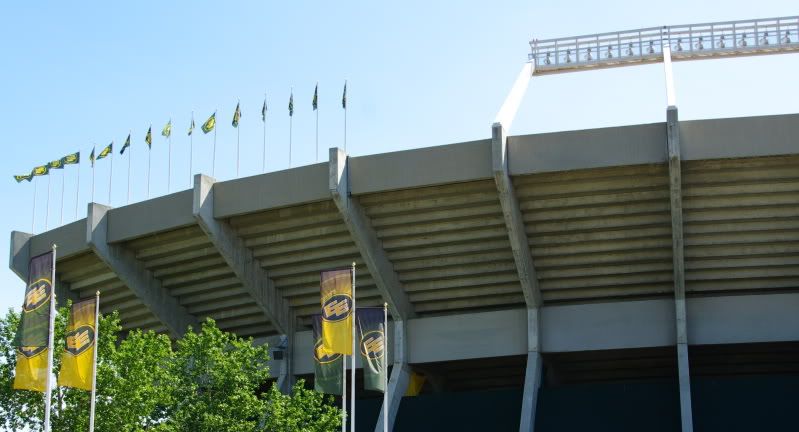
Because of that perfection though, anything outwardly recognizable as human has been suppressed. From the outside it could be the fossilized remains of some prehistoric creature, an elaborate burial monument, or just a giant abstraction. The key point is that it is colossal, because like an Airport or a Refinery people aren't the driving factor here. Commonwealth is built on the scale of firstdowns, and is designed for the swarm or throng. The individual is secondary and there is no pretense to the contrary.


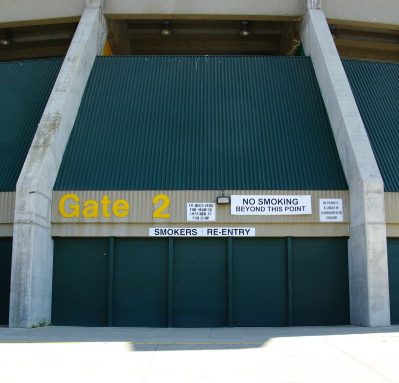
Entrances obviously serve a basic functional role, but beyond that they have always had an important symbolic value. An entrance is the threshold between interior and exterior or between us and them, and is generally celebrated or embellished with visual cues. At Commonwealth the entrances are hidden behind the same cladding that is used throughout, vanishing into a seemingly unbroken shell, and distinguishable only because of typography. Even when you identify which wall sections are the entrances, there is nothing to say that these are necessarily for people. Their generic nature could just as easily be intended for cattle or vehicles.

A wall along the north is the only detail to reveal that Commonwealth does exist in a world of people. It is recognizable as human-scale by virtue of being just tall enough to keep people out.


When Commonwealth was built in the late 1970's the year 2001 was still the distant future, and like a lot of brutalism I think that it was built for that future.

When 2001 actually arrived though, it wasn't interested in being the future anymore. Commonwealth grew wings, and for the first time it had recognizable doors and even windows. It had a new facade built around familiar distances like 50', stucco textured to appeal to a vague memory of brick and masonry, and comfy earthtones drawn on with a thick marker.


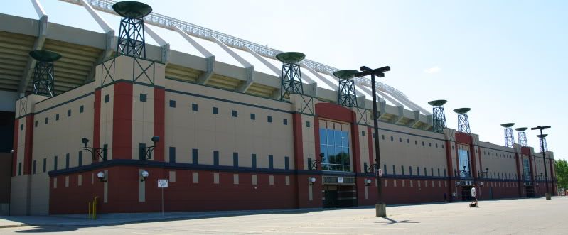
This is powercentre architecture. The repeated sculptural elements in particular - with their easy hints of an oil derrick, the Grey Cup, and Olympic flame, and maybe the chalice of mythology - are the decoration of suburban parking lots. They are symbolism reduced to a game of pictionary.

If Commonwealth was too austere and distant, then this swings too far the other way as a pantomime of what a building should look like. Where Commonwealth implies permanence this screams disposable, and where Commonwealth made a statement this isn't even trying.

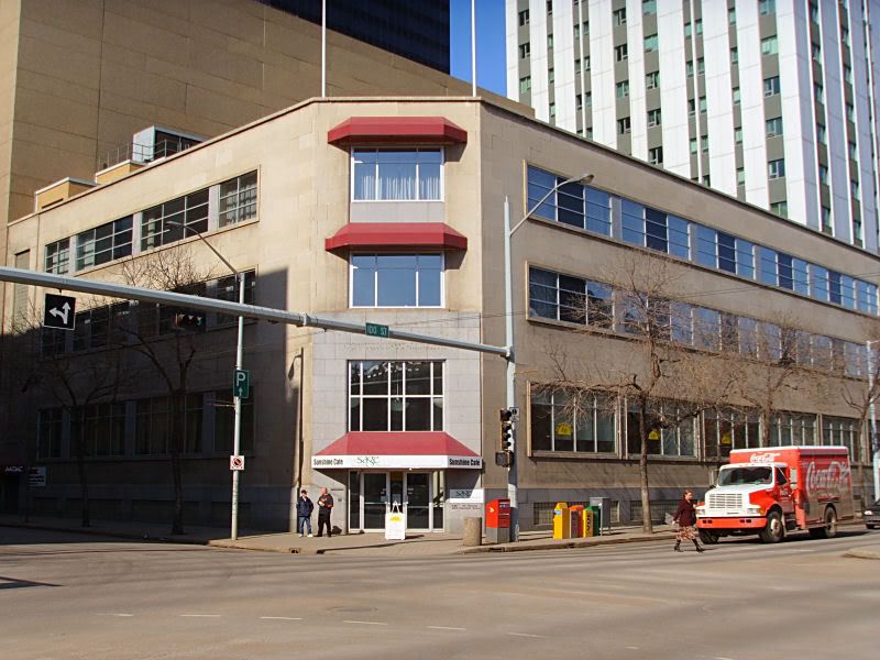
As for the model, Commonwealth Stadium and Rexall Place are a bit of a matched pair, and there are two Rexall Place models (here and here) that other people did back in 2007. I guess that NHL arenas are more interesting than CFL ones? I'm not in the area very often, so it took me quite a while to get around to making Commonwealth.

If you look at the satellite photos of the stadium you'll see that there's a severe foreshortening happening, with one side looking much deeper than the other. That made the model a bit tricky, because I don't know which side was actually correct. Because of that many of the dimensions - particularly of the curves in the corners - are a bit made up.

There is also a gym that is located on the south side of the stadium which isn't included in the model. When I was taking photos the entire southern section of the site was being excavated for the construction of a new Recreation Centre. Rather than model the gym now, I decided to wait until the rec centre is complete.

10830 Jasper Avenue


Model and Building information


Model and Building Information

It was however, a building doomed by its material choices. The drab concrete lattice over the drab brown brick is tough to defend, and the building probably looked tired and dirty on the day that it opened. Maybe if the brick had been red or if the lattice was a shiny aluminum then there would have been more affection for the building, or at least it might have been less disliked. The new version and all of its crazy shapes upholds the quirkiness of the original, but I do wish that they'd somehow managed to integrate the lattice into the new design.

This will mark the fifth shiny blue office building prominently visible from Jasper Avenue (sixth if you count all the way down to 124st). With it's odd shape there is no real risk that it will be confused with any of the others, but some diversity wouldn't hurt. Downtown Edmonton is already a sea of brutalist concrete, and I'm not sure that striking back with a wave of reflective blue monoliths is the way to go. Would another Bell or Canadian Western Bank have been too much to ask?

One nice change is that the windows are a slightly different blue than the spandrel panels below them. This combined with the exaggerated horizontal mullions and the hidden vertical mullions gives it a banded appearance, rather than the uniformity of Manulife or the new Devonian. I think they could have gone a bit further with it though, either darkening the spandrels or making the windows more transparent (humbug to energy efficiency). The banding is prominent but it doesn't quite pop, and on a cloudy day you might not even notice it.

The building is also subject to the same height restrictions that have led to downtown Edmonton's many cubic "high-rises" which are as tall as they are wide. 10830 is actually quite a bit wider than it is tall, but the manic massing tries to hide that. That seems to be the approach Procura will be taking with all of its developments in the area, which should feel more interesting than the duplo-blocks-as-urban-design approach of the government area a few blocks to the south.

It also goes without saying that the new retail spaces will be such a welcome addition to Jasper, in an area that has been a black hole for a decade? More?

Seniors Association of Greater Edmonton


Model and Building information

In the real world, the SAGE building is marred by the ugliest and most unflattering awnings imaginable:


It's also located on 102A avenue which is one of downtown Edmonton's dumpiest and most redundant streets. It is closed during the summer months, and the architecture of City Hall and Churchill Square all but begs you to ignore it. To add to the gritty ambiance there are not one - not two - but three separate pedways, along with the City Centre East loading dock:


I really like the building, though. It's just nice, simple mid-century commercial, with windows that are deceptively huge. It doesn't have great street interaction, but in a perfect world the windows on the main floor would be replaced with ones that are operable, so that the cafe could open up onto the street when the weather is nice.

The flags are once again artistic license. I realize that flying a flag does take some effort and maintenance, but I really wish more downtown buildings would make use of their flagpoles.

Royal Alberta Museum


Model and Building information

This is a tough one. I quite like the RAM, especially the main entrance and the long plaza. It is majestic, while still being peaceful. And some of the materials and interiors are just gorgeous.

But.

Having a site like that, and basically ignoring the river valley? Even the layout of the grounds seems designed to keep people safe from having to experience the cheap showiness of nature. Tourists do seem to find the Pagoda in the southeast corner of the site, which is good. But even there you're not presented with a lookout over the river, so much as just a hole through the trees. The best view on the entire site is probably from the carriage and utility house, which the public doesn't have access to.

Also, the north elevation facing onto 102 avenue is just terrible. I assume the design was intended to minimize the disruption to the existing residential surroundings, but it doesn't. It's brutal in both style and effect. Edmonton was certainly a different city when the museum was built in 1967, but 102 avenue is now a main route into downtown from the west end, and overhead doors really don't present the best face of a Royal museum.

And all of that is a long way of saying that in 2005 a major addition and renovation of the RAM was proposed, and while normally I'm a defender of modern architecture, in this case I say bring on the reno. I like the original building, but it's certainly not perfect. The proposed addition unfortunately destroys the best parts of the original museum, but it also addresses all of the worst. That project has now been in government funding limbo for several years though, so it is anyone's guess if it will ever happen.

In terms of the model, it is pretty straightforward. The carvings on the south elevation of the theatre are all accurately reproduced in the model, so there's no cheating here.

Queen Elizabeth II Planetarium


Model and Building information

Here is another building that I hope will find new life one day, although it's tough to know what that might be. The large windows overlooking Coronation Park would make a restaurant ideal, except that at only a few thousand square feet installing a commercial kitchen probably isn't feasible. Also, as wonderful as the setting is it has limited access and parking, and is undeniably out of the way. So realistically maybe a teahouse for special events, or a gallery or small museum? Right now it seems to be used for document storage, which is a shame.

The building is also in pretty bad shape, with damage to the concrete and tile, as well as the addition of a charming loading dock.


Groups like the Edmonton Design Committee have taken up the cause of the Planetarium, and hopefully it will not be forgotten.

Peter Hemingway Fitness and Leisure Centre


Model and Building information

A "favourite" building is a tough thing to define, but after a few years of mulling it over I am pretty sure that mine must be the former Coronation Pool. Walking around it on a beautiful day is almost a religious experience; it seems to float above the ground, but is held down by huge concrete tentpegs; 40 years of wear have just given its surface a nice patina; and probably most importantly, there is nothing else like it in Edmonton.

So if Coronation Pool is my favourite building, then it was also somewhat of my White Whale. I had originally started the model in September of 2007, along with the Telus World of Science and QEII Planetarium. TWOS and the Planetarium turned out fine, but I could not get Coronation to work. I tried a few more times over the years, but the geometry was just too confusing. I've certainly given up on other buildings before, but that was because of boredom or because I didn't like the photos I had, but with Coronation I just didn't know how to do it.

When I did successfully model it, I didn't really do anything differently. I still don't know how tall it is, or the radii of any of the curves. The model is built on cheating and guesswork, but I think it turned out pretty well.

Baker Clinic


Model and Building information

And here is where my agenda comes in. I don't really like the Baker Clinic - in fact I actively dislike the Baker Clinic of today. When making this model I wanted it to be better than the real thing, and so I undid all of the changes that have been made to it since 1959.

There are a total of 4, the most prominent being the replacement of the original, simple sunshades with a truly awful Mad Max-ian Faraday cage. Bring back the originals - I don't care if they didn't actually keep the building cool.

So this is really the Baker Clinic c. 1959, and it's a building that I would be okay with. I will never like the 1950's turquoise fetish, which I consider to be the architectural equivalent of the marigold appliances of the 1970's.

Fifth Street Lofts and the Ellis Building


Model and Building information

I've never really like the Fifth Street Lofts. I'm not sure why, because it is definitely the type of building that should appeal to me, and yet it doesn't.

I think the Ellis Building is great, though.


Model and Building information

There's just something about its Gropiusness that works so very well.

Barnett House


Model and Building information

This might have to be added to the "demolished" list soon, because apparently the ATA plan to add two additional storeys to the tower and to upgrade the building envelope. The first four floors were built in 1964, with the fifth and sixth added in the 1980's. That addition obviously just acted as a continuation of the original building, but I don't hold out hope for the upcoming one. The East wing of Barnett House was reskinned in 1999, replacing its cool 50's vibe with a nice-enough-but-rather-dull glass box.

And that's a shame because Barnett House is just a wonderful modern structure.

Oliver Telephone Exchange


Model and Building information

Tucked away in Oliver, the telephone exchange is a quaint little building with an addition that I think actually works. It doesn't try to compete with the original, but has a funky modern identity all its own.

Law Courts


Model and Building information

The wacky side of Modernism. Form follows function, so lets build an upside-down ziggurat-thing. (I'm sure that the volumes do transparently express the various uses, I just don't understand it).

I quite like the building though, in spite of its absolutely abysmal relation to its surroundings. The plazas to the west and south are nice enough, but wow are the 104ave and 97st sides stark. It's making a statement and I can get behind that, but sometimes I wish the statement it was making wasn't so rude.

This model took me a long, long time. Looking at the files, it was created in June of 2007. I made a few attempts, and then gave up. I came back to it in September 2008, and gave up again. It was finally completed in April 2009.