I don’t really like the new art gallery.
I haven’t been inside it yet, and I do expect that the interior spaces will probably improve my opinion a bit. Based solely on the exterior though - having now had a few months to come to terms with it, and having recently spent a fair bit of time thinking about how it works in order to get the model right - I’m not really a fan.
The new gallery is certainly a good thing for Edmonton. The design competition got people interested in architecture. The AGA now has better space and (a little) more room. And it is a building that people seem to like and find interesting (for now, anyway). So it is undeniably a positive for the city, but that doesn’t mean it is beyond criticism.
Paint it black
My main concern with the building is the glazing. It has a grey reflective tint which I think was a huge mistake.
This is what was shown in the early renderings:
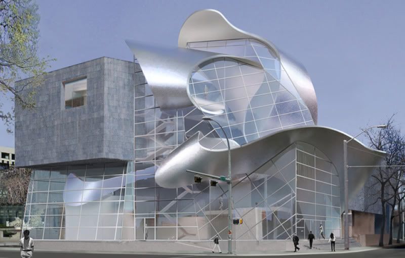
With some tweaking and artistic license this is closer to what we got:

The main feature of the AGA is the Borealis sculpture. It twists through the building, and in the rendering its transitions from interior to exterior and back again are clearly visible. The Borealis can be perceived as a single element that weaves throughout the entire building and that binds it all together. Unfortunately the reality is that the windows are hard barriers, and the Borealis actually appears as a decapitated collection of confused and seemingly unrelated elements. Any connection between exterior and interior is lost.
This lack of connection also has a dramatic effect on the way that the building relates to its surrounding. This is the gallery’s restaurant during weekend brunch:
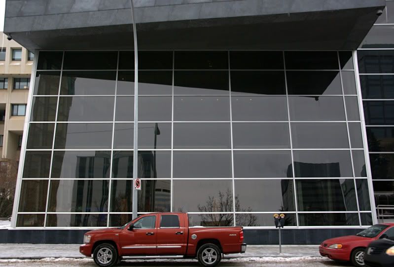
This is a lifeless building. City Hall across the street uses transparency to great effect, but here the glazing is dead and inert. The building is already very, very grey and the windows should add lightness to it, but instead they only make it worse.
This is exaggerated by the way that the building fills its small site. The old gallery had a sizeable front plaza, but that is now gone with the expansion pushing right up against the property line. This was probably for the best since it increases the gallery's prominence from Churchill Square, but it means that there is no longer any transition space. The entrance is a labyrinth of practical ramps and railings, and there is no space left to just breath. You are either inside or you are outside; separated by the cold, dark glass.
During the design competition there was praise over the fact that Stout Architects recognized Edmonton as a winter city, and provided a snowy rendering to match. In recognizing us as a winter city though, they appear to have failed to realize that we are equally not a winter city. The gallery will undeniably look its best when it is lit up during the darkest depths of winter. At the height of summer, though – when Churchill Square is filled with crowds and the sun is shining late into the evening – it will be an inanimate grey lump squatting on the corner.
The unfortunate tint does serve a purpose - it is presumably there to reduce the cooling load on all the east, south and west facing glazing. That is an admirable enough goal, except that this is a building that is wrapped in a giant metal bow. Taken in that light any arguments of prudence ring a bit hollow. The tint significantly weakens the overall design, and it destroys the building’s interaction with its surroundings. It was not worth it.
Getting it (w)right
The debate over elaborate galleries that overshadow their collections has been around since at least Wright's Guggenheim, and likely for much longer than that. The millennial fad of starchitecture has taken that a step further, and now the world is dotted with galleries and museums that are as much sculpture as they are structure.
At first glance the AGA seems to be yet another example of this, but there is one important difference. Rather than being a sculptural building, the AGA is much more of a building and a sculpture. Generally with Gehry, Calatrava, Libeskind, Hadid and the others the line between building and sculpture is difficult to determine - just where does the space end and the flourish begin? With the AGA that point is easy to identify:
Building + Sculpture
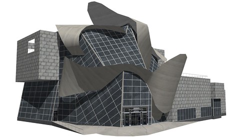
Building
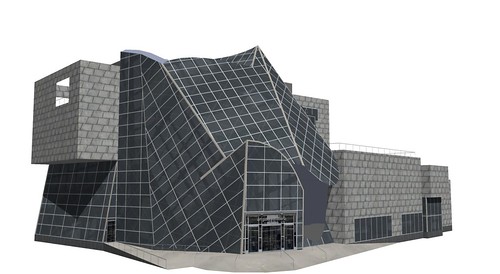
This brings up an idea - view a gallery exterior as a blank wall that is simply another display space for art. Build a structure that is functional enough, and then install a large-scale sculpture on, in, or through it. Then every decade or two commission a new work, and move the old one to a nearby park. It could keep a building fresh in the mind of a fickle public, while also strengthening a city's public art program (although the logistics of it would certainly be a nightmare).
Depending on your perspective that could sound like either an excellent idea, or a terrible one. The AGA is already a fair distance down that road, though. It is a building that effectively has a large sculpture as part of its permanent collection, but it has also been designed specifically for that sculpture. What I have to wonder is if the Art Gallery of Alberta were to commission a great sculpture for their collection, would Randall Stout be the artist that they would choose?
This item has been discontinued by the manufacturer
Treating a building as structure + art leads to some interesting questions. Here is an earlier rendering of the gallery from the design competition:

If I had to quickly describe the AGA I would mention the zinc, the cantilever, and the swoopy bits. I think that those three elements are the key to its aesthetic; the swoopy bits being the most dominant and defining part of the "look" of the building. From concept to reality then, all three of those elements are still in place. It also seems that the bulk of the square footage - the back section, the restaurant and the cantilever - remains basically unchanged. The swoopy bits however, and the whole front section around them, are completely different. They have the same basic style, and if they were actually sculptures they would clearly be part of the same series, but they are also distinct works that look quite different from one another.
If a building is structure + art, and if you swap out the art with a different piece, do you still have the same building? Is one Stout sculpture just as good as the next? Did they just run out of the first one, or did it get used somewhere else? What if you really liked the curved knife-edge that was over the restaurant in the early design, or the way that the ribbon was kinked at the rear? Is art really fungible?
I'm not saying that buildings can't change from concept to construction. If a design from one of the other architects had been selected it would certainly have seen some evolution. In a combination of structure + art though, what drives a wholesale change in the art? The Borealis sculpture does have a bit of a functional role, as it supports a fourth floor meeting room and wraps around the main stairs. Was it impossible for the original sculpture to meet those constraints? The changes from concept to reality may demonstrate how flexible the overall design is, but they also reveal how arbitrary it is.
Form follows whim
It irks the modernist in me that a building's appearance can change so significantly without a corresponding change in program or function. It probably irks the classicist in me too, since it's not like the ancient Greeks just threw things together either. If you are feeling charitable though, you could argue that by distilling today's trends down to structure + art the AGA is simply being honest.
We are in a time when clients clearly expect grand, sculptural gestures. Rather than using showy contortionism to twist a building into a pretzel, why not just build a grand sculpture? Prior to the rise of modernism architecture and sculptural embellishment did go hand-in-hand, so it's possible that this is just a return to an older tradition? I don't happen to view the building that way, but you could if you wanted to. I tend to see it more as a cynical attempt to give people what they want; I will accept that the truth is likely somewhere in between.
What's new is old
When the winning design for the AGA was announced back in 2005 it felt old. Gehry's Guggenheim and Concert Hall are two of the most photographed and filmed buildings in the world, and wouldn't it have been for the best to just shy away from anything superficially Gehryesque? How could anything measure up, let alone actually feel new or exciting?
In the intervening years I've softened a bit on this. The building is still desperately trendy, and it is still a decade too late. It is also a building though, and what is one decade in the life of a building? In a few years no one will remember whether it was built in 2000 or in 2010. It will be clearly recognizable as one of those galleries and museums that everyone was building at the dawn of the shiny new millennium, and whether it was a leader or a follower will fade.
It certainly won't put Edmonton on the map though, since mid-sized cities around the world have all tried to capture some of that old Bilbao magic with similar projects. And as Edmonton's great leap forward it is unfortunate that we had to clutch so tightly to the coattails of others. It is the only building of its kind for nearly a thousand kilometers though, and even in our electronic world that still has importance.
Grist for the mill
What is one decade in the life of a building? In Edmonton a lifespan can be troublingly brief - the old art gallery was a few years shy of forty when it was torn down.
Some people loved the old gallery and others hated it. It certainly wasn't exciting or cuddly, and this city has no shortage of other brutalist concrete, so a general disregard and apathy are not surprising. For my part I liked it, but I didn't love it. I really liked the second floor space, but disliked the first. As with anything it had the good and the bad.
Of the four proposals for the new gallery two of them (and possibly a third - it's hard to remember) worked to incorporate the old gallery. The winning design didn't. It is certainly true that a large section of the original building still remains at the rear, but rather than being preserved or highlighted it has been rendered unrecognizable. It was simply consumed as a raw material and nothing more.
There were other options available, but this is the one we chose. Sadly, that is typical of Edmonton. History is an embarrassment that should be wall-papered over. If we could just start from the beginning again, this time we could make everything perfect. We've been trying that for at least fifty years now, and I don't think it's worked yet.
All the angles
With all of that - the lifelessness, the intellectual three card monte, the calculated fadishness, and the casual dismissal of the past - if I actually liked the new building none of it would really matter. Unfortunately though, I just don't find it appealing. In particular, the defining view from Churchill Square does nothing for me:

It looks like someone killed a transformer - there's a leg, and the head, and some fingers, and an ear. I don't understand the flat surface at the end of the cantilevered section, which is governed by a sense of aesthetics and proportion that is completely alien to me. I can only assume that is where banners will eventually be displayed to promote the exhibitions? For now though, that comically oversized balcony is more funhouse than expressionist.
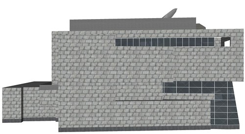
I do like the North elevation. It is brutal to the point of giving the old gallery a run for its money, but I think it works surprisingly well:
And while working on the model I discovered that the South elevation has some charms of its own:
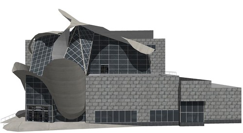
I think this angle pulls off lyrical chaos much better than the typical view from the square. Unfortunately though, the only way to see the gallery from this angle is from the inside of Chancery Hall across the street. The view that most people will see from streetlevel is rather less impressive:

I have also realized that I've been a bit unfair in my judgement of the galley. Seeing the rendering of the early concept has forced me to admit that I really do prefer what we got to what was originally proposed. And as the gallery took shape I was definitely prejudiced; transferring my initial dislike for the concept onto the new building. I obviously still don't think it's great, but it is definitely better. And hopefully the interior will wow me a bit once I've visited.
The glazing really is unforgivable, though. One day it will need to be replaced, and we will thankfully have a chance to fix it. Unfortunately though, when that day arrives people just like me will be defending the black glass as an integral part of the design.
4 comments:
Good article! It's nice to see some thoughtful criticism of the new building.
And well done on the 3D model, as usual.
Thanks. It's a bit longer than a normal post, but the Gallery certainly does provide a lot to think about.
That black glass though...euch.
I think they had to change the convolution of the metal ribbon, once they realized (ie. had it pointed out to them) that as it was originally designed, it would create hazards with freezing and thawing, ultimately falling, ice and snow. So, now it is designed against those hazards, and now they boast how it is "designed purposely to catch the snow" etc., as if catching snow were an aesthetic goal...
So, yeah, there's that, plus the glass, plus a host of other problems... the list goes on.
Hi Christian. Your against-the-grain essay on the shortcomings of the new AGA building is well-reasoned and interesting. I'd love to post it as a C2E guest column. If you're interested, just send it to me.
Kenn
Post a Comment